
매달, 우리는 1000명 이상의 사람들이 시험 준비를 잘하고 시험을 잘 통과할 수 있도록 도와줍니다.
Salesforce Certified Tableau Data Analyst 온라인 연습
최종 업데이트 시간: 2025년11월17일
당신은 온라인 연습 문제를 통해 Salesforce Salesforce Certified Tableau Data Analyst 시험지식에 대해 자신이 어떻게 알고 있는지 파악한 후 시험 참가 신청 여부를 결정할 수 있다.
시험을 100% 합격하고 시험 준비 시간을 35% 절약하기를 바라며 Salesforce Certified Tableau Data Analyst 덤프 (최신 실제 시험 문제)를 사용 선택하여 현재 최신 120개의 시험 문제와 답을 포함하십시오.
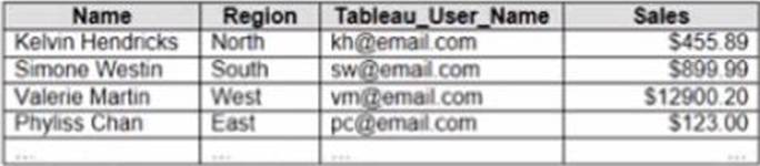
정답:
Explanation:
To create a boolean calculated field to place on the data source filter, you should use the formula USERNAME() = [Tableau_user]. This formula will return TRUE if the current Tableau user name matches the value in the Tableau_user field, and FALSE otherwise. You can use this formula as a data source filter by dragging it to the Filters shelf and selecting TRUE from the menu. This will filter the data to show only the rows that are relevant to the specific Tableau user.
The other options are not correct for this scenario. NAME([Tableau_user]) is not a valid function in
Tableau. ISFULLNAME([Tableau_user]) = USERNAME() is not a valid expression in Tableau. ‘S’ +
STR([Sales]/1000) is not a boolean expression, but a string expression that converts sales to
thousands with a prefix of “S”.
Reference:
https://help.tableau.com/current/pro/desktop/en-us/filtering_datasource.htm
https://help.tableau.com/current/pro/desktop/en-us/functions_functions_logical.htm#USERNAME
https://help.tableau.com/current/pro/desktop/en-us/calculations_calculatedfields.htm
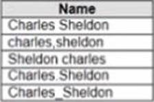
정답:
Explanation:
To group all five names automatically, you should use Manual Selection as a grouping option in Tableau Prep. Manual Selection is a feature that allows you to select values from your data and group them together based on your criteria. You can use Manual Selection by clicking on Group Values in Profile pane > Manual Selection from the menu. This will open a dialog box where you can select values from your data and assign them to a group.
In this case, you want to group all five names together based on their spelling variations. You can use Manual Selection by selecting all five values from your data and assigning them to a group named “Harry Potter”. This will create a new field named Grouped Field that contains “Harry Potter” as one value.
The other options are not correct for this scenario. Pronunciation is a feature that groups values based on how they sound, but it may not work well with names or uncommon words. Spelling is a feature that groups values based on common spelling errors or typos, but it may not recognize all variations or synonyms. Common Characters is a feature that groups values based on the number of characters they share, but it may not capture the meaning or context of the values.
Reference:
https://help.tableau.com/current/prep/en-us/prep_group.htm
https://help.tableau.com/current/prep/en-us/prep_group_manual.htm
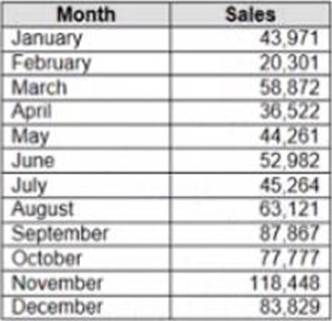
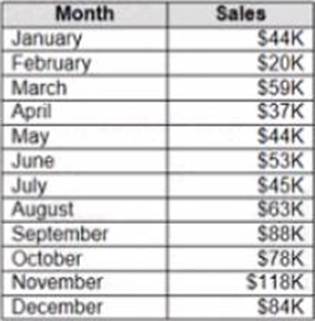
정답:
Explanation:
To make Sales appear automatically as shown in the second table, you should change the default number format of the Sales field. The default number format is how Tableau displays a field when you drag it to a worksheet. You can change the default number format by right-clicking on the field and selecting Default Properties > Number Format from the menu. This will open a dialog box where you can choose a category, such as Currency or Percentage, and customize the options, such as decimal places or prefixes.
In this case, you want to change the default number format of Sales to Currency with zero decimal places and a custom prefix of “S”. This will make Sales appear as “S” followed by the rounded value in thousands.
The other options are not correct for this scenario. Changing the data type of Sales to String will not affect how it appears on a worksheet. Creating a calculated field that uses a formula will not change the default number format of Sales, but create a new field that you have to drag to a worksheet.
Converting Sales to Attribute will return only one value for each partition of data, which will not show any variation over time.
Reference:
https://help.tableau.com/current/pro/desktop/en-us/formatting.htm
https://help.tableau.com/current/pro/desktop/en-us/formatting_change_default.htm
정답:
Explanation:
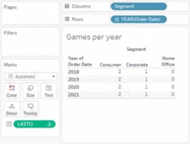
The value that will appear in the crosstab for the Consumer segment of the year 2018 if you change compute to use Order Date is 0. The Last() calculation is a table calculation that returns the number of rows from the current row to the last row in the partition. The partition is determined by how you compute the calculation. In this case, you change compute to use Order Date, which means that the calculation will be performed for each value of Order Date.
The crosstab shows that there are two values of Order Date for the Consumer segment of the year 2018: Q1 and Q4. The Last() calculation will return 0 for Q4, because it is the last row in the partition. It will return 1 for Q1, because it is one row away from the last row in the partition.
The other options are not correct for this scenario. The Last() calculation will not return 2, 3, or 4 for any value of Order Date, because there are only two values in each partition.
Reference:
https://help.tableau.com/current/pro/desktop/en-us/calculations_tablecalculations.htm
https://help.tableau.com/current/pro/desktop/en-us/calculations_tablecalculations_functions.htm#LAST
정답:
Explanation:
To add a draft watermark to a dashboard, you should use a sheet as a type of object. A sheet is a worksheet that contains a chart or a table that you can add to your dashboard. You can create a sheet that shows the word “Draft” as a text mark and format it with transparency, size, and color. Then you can drag the sheet to your dashboard and position it behind your other sheets as a floating element. You can also adjust the opacity and layering of the sheet to make it look like a watermark.
Reference:
https://help.tableau.com/current/pro/desktop/en-us/dashboards.htm
https://help.tableau.com/current/pro/desktop/en-us/dashboards_create_layouts.htm
https://help.tableau.com/current/pro/desktop/en-us/dashboards_create_watermarks.htm
정답: 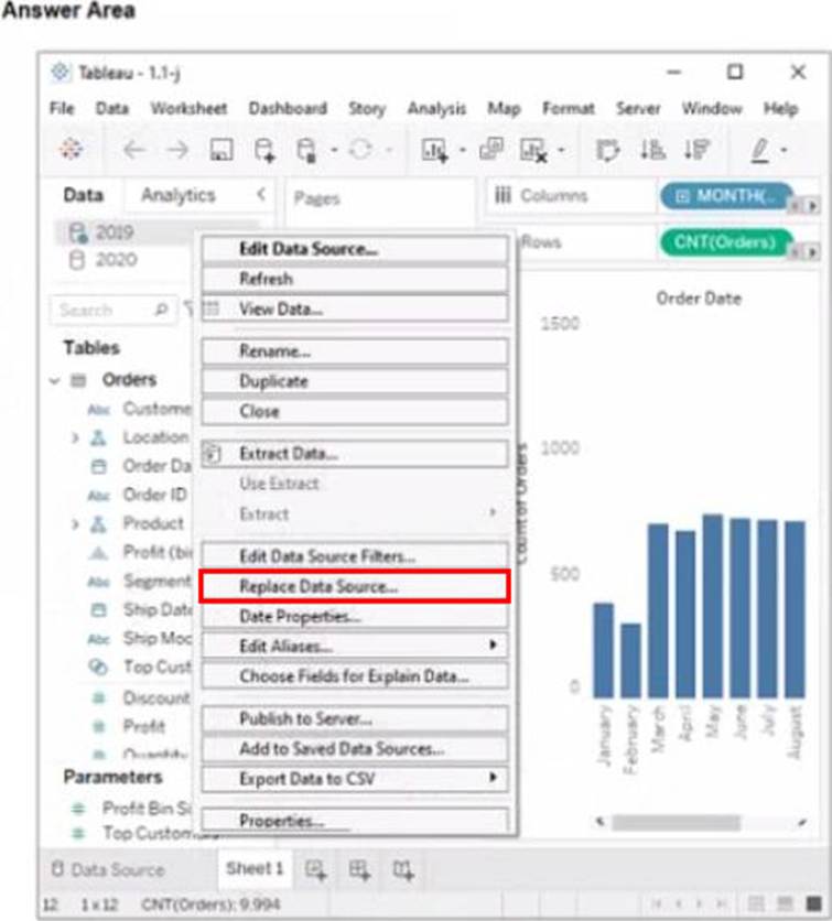
Explanation:
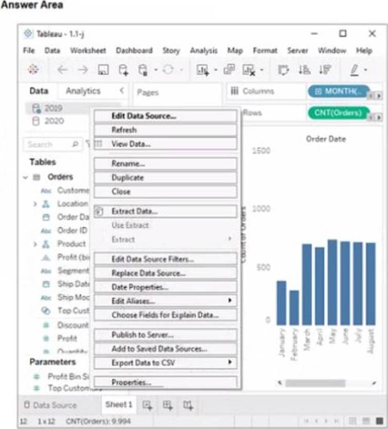
Replace Data Source
Replace Data Source is a feature that allows you to replace one data source with another one that has the same or similar fields and structure. It updates all the worksheets that use the original data source with the new one, without reloading the data. In this case, you want to replace the data source that contains order data from 2019 with the one that contains order data from 2020.
To replace the data source, you need to do the following steps:
Go to the Data Source tab at the bottom of the workbook to see the data source page. You will see a table that shows the fields and values from the original data source.
Click on the drop-down arrow next to the data source name at the top of the page and select Replace Data Source from the menu. This will open a dialog box that allows you to replace your data source with another one.
Select the data source that contains order data from 2020 from the list of available data sources and click OK. This will replace your original data source with the new one and update your worksheet accordingly. You may need to fix any broken fields or calculations that result from the replacement.
Reference:
https://help.tableau.com/current/pro/desktop/en-us/datasource_replace.htm
https://help.tableau.com/current/pro/desktop/en-us/datasource_replace_workbook.htm

정답:
Explanation:
To combine the two tables that contain data about books in a library and ensure that all the data is retained, you should use a full outer join. A full outer join is a type of join that returns all rows from both tables, regardless of whether there is a match or not. If there is no match, null values are filled in for the missing fields.
To perform a full outer join, you need to do the following steps:
Connect to both tables as your data sources in Tableau. You can use either live or extract connections. Drag one table to the canvas and drop it on top of another table. This will create a join between them based on a common field.
Click on the join icon between the tables and select Full Outer Join from the drop-down list. This will change the join type to full outer join and show all rows from both tables.
Optionally, you can add or remove join clauses by clicking on Add or Remove buttons next to each clause. You can also change or rename fields by clicking on them.
The other types of joins are not correct for this scenario. An inner join returns only the rows that have a match in both tables, which will exclude any books that are missing from either table. A left join returns all rows from the left table and only the matching rows from the right table, which will exclude any books that are only in the right table. A right join returns all rows from the right table and only the matching rows from the left table, which will exclude any books that are only in the left table.
Reference:
https://help.tableau.com/current/pro/desktop/en-us/joining_tables.htm
https://help.tableau.com/current/pro/desktop/en-us/join_types.htm
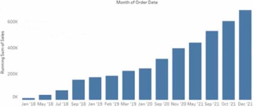
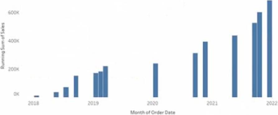
정답:
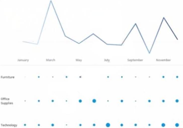
Explanation:
To make the months appear as shown in the second chart, you need to convert the date to Continuous. A continuous date is a green pill that shows a range of values on an axis. A discrete date is a blue pill that shows individual values as headers. In this case, you want to show a continuous range of months on the x-axis, instead of discrete headers.
To convert the date to Continuous, you need to do the following steps: Right-click on the date field on the Columns shelf and select Convert to Continuous from the menu. This will change the date pill from blue to green and show a continuous range of dates on the x-axis. Right-click on the date field again and select Month (January 2017) from the menu. This will change the level of detail of the date to month and year, instead of day.
Optionally, you can format the date axis by right-clicking on it and selecting Format from the menu.
You can change the scale, tick marks, labels, and other options.
The other options are not correct for this scenario. Converting the date to Exact Date will show every single date as a header, which will be too crowded and unreadable. Selecting Show Missing Values for the date will fill in any gaps in the data with null values, but it will not change how the months appear. Converting the date to Attribute will return only one value for each partition of data, which will not show any variation over time.
Reference:
https://help.tableau.com/current/pro/desktop/en-us/dates.htm
https://help.tableau.com/current/pro/desktop/en-us/dates_continuous.htm
https://help.tableau.com/current/pro/desktop/en-us/formatting.htm
정답:
Explanation:
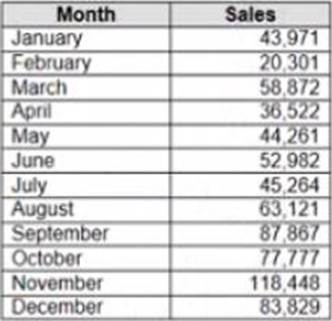
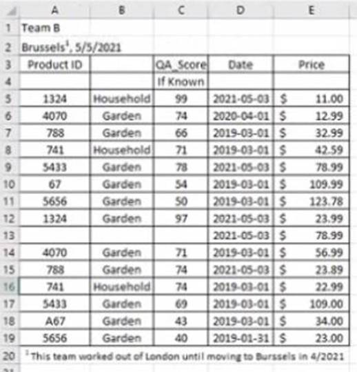
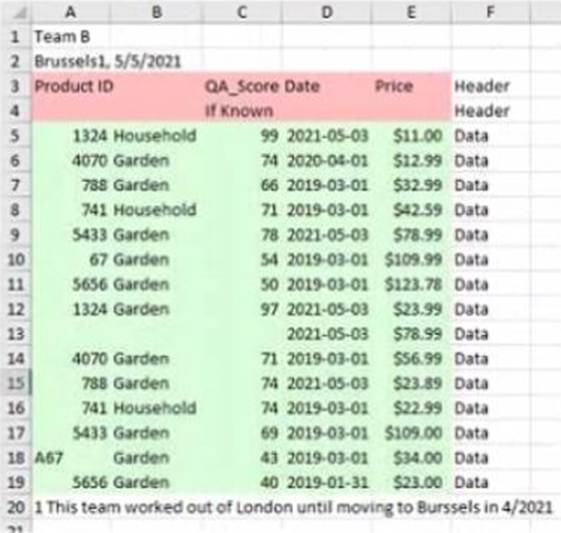
Data interpreter is a feature that helps you clean and structure your data in Excel before importing it into Tableau. It detects and removes any headers, footers, subtotals, or other elements that are not part of the actual data. It also splits any merged cells and fills in any missing values.
In this case, data interpreter provides the following results:
It removes the first three rows and the last two rows that contain headers and footers.
It splits the merged cells in column A and fills in the missing values with “Fiction” or “Non-Fiction”.
It does not remove or change any other rows or cells.
Therefore, the number of rows of data that will be ingested into Tableau as values is 17, which is the number of rows left after removing the headers and footers.
Reference:
https://help.tableau.com/current/pro/desktop/en-us/importing_cleaning_up_data.htm
https://help.tableau.com/current/pro/desktop/en-us/importing_data_interpreter.htm
정답:
Explanation:
When you sign in to a Tableau Server site from Tableau Desktop and search for a published data source, you will see all the data sources published to the site within the folders to which you have access. You will not see data sources published to other sites or folders that you do not have permission to view. You can also filter your search by project, owner, or tag.
Reference:
https://help.tableau.com/current/pro/desktop/en-us/connect_basic.htm
https://help.tableau.com/current/pro/desktop/en-us/connect_tableauserver.htm
정답: 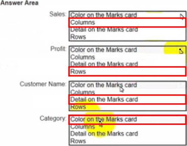
Explanation:
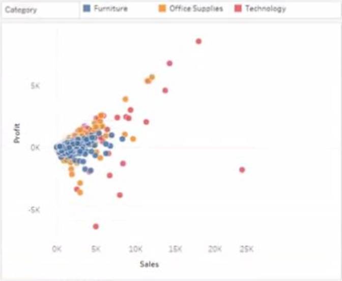
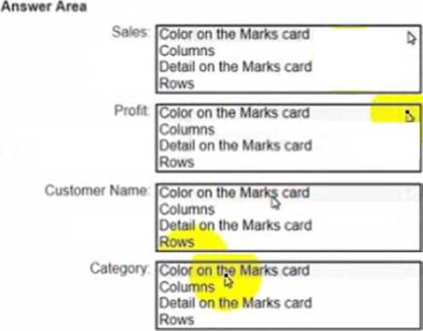
Sales: B. Columns
Profit: D. Rows
Customer Name: C. Detail on the Marks card
Category: A. Color on the Marks card
To create the visualization, you need to drag Sales to Columns, Profit to Rows, Customer Name to Detail on the Marks card, and Category to Color on the Marks card. This will create a scatter plot that shows the relationship between Sales and Profit for each Customer Name, with different colors for each Category.
Reference:
https://help.tableau.com/current/pro/desktop/en-us/buildmanual_shelves.htm https://help.tableau.com/current/pro/desktop/en-us/buildexamples_scatter.htm
정답:
Explanation:
A data source filter is a filter that applies to all the worksheets that use the same data source. It filters the data before any other filters or calculations are applied. You can add a data source filter from the Data Source page by clicking on the Add button next to Filters.
The type of filter that will appear in the Edit Data Source Filters dialog box is a dimension filter on all the sheets. This means that you can choose a dimension from your data source and filter it by values, range, condition, or top/bottom. The filter will affect all the worksheets that use that dimension.
The other types of filters are not data source filters and will not appear in the Edit Data Source Filters dialog box. A table calculation filter is a filter that applies to a table calculation, such as percent of total or running total. A top N condition filter is a filter that shows only the top or bottom N values of a measure or dimension based on a condition. A context filter is a filter that creates a subset of data that other filters can use.
Reference:
https://help.tableau.com/current/pro/desktop/en-us/filtering_datasource.htm
https://help.tableau.com/current/pro/desktop/en-us/filtering.htm
https://help.tableau.com/current/pro/desktop/en-us/filtering_tablecalculations.htm
https://help.tableau.com/current/pro/desktop/en-us/filtering_topn.htm
https://help.tableau.com/current/pro/desktop/en-us/filtering_context.htm
정답: 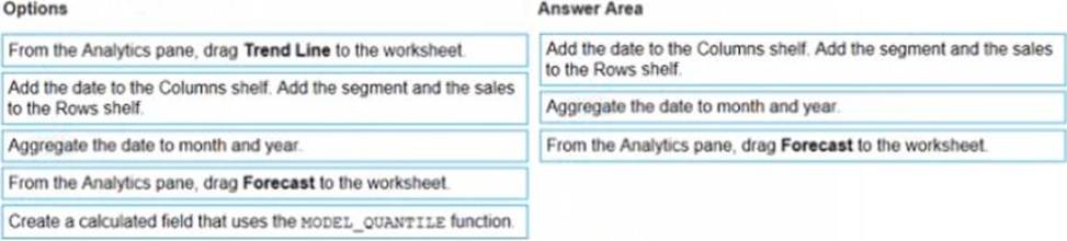
Explanation:
The correct order of the three actions is:
Add the date to the Columns shelf. Add the segment and the sales to the Rows shelf.
Aggregate the date to month and year.
From the Analytics pane, drag Forecast to the worksheet.
The first action is to add the date to the Columns shelf and the segment and the sales to the Rows shelf. This will create a line chart that shows the daily sales by segment over time. You can use the Show Me menu to choose a line chart if it is not selected by default.
The second action is to aggregate the date to month and year. This will group the daily sales into monthly sales and show the yearly trend. You can right-click on the date field on the Columns shelf and select Month (January 2017) from the menu. You can also drag Year from the Dimensions pane to the Columns shelf before or after Month.
The third action is to drag Forecast from the Analytics pane to the worksheet. This will add a forecast that predicts future sales by segment based on historical trends. You can customize the forecast by clicking on it and using the options on the Marks card.
The other options are not relevant for this scenario. Adding a trend line would show a linear or nonlinear relationship between two measures, but not a prediction of future values. Creating a calculated field that uses the model quantile function would return a value from a statistical model based on a given quantile, but not a forecast.
Reference:
https://help.tableau.com/current/pro/desktop/en-us/analytics.htm
https://help.tableau.com/current/pro/desktop/en-us/buildmanual_shelves.htm
https://help.tableau.com/current/pro/desktop/en-us/dates.htm
https://help.tableau.com/current/pro/desktop/en-us/analytics_forecast.htm
https://help.tableau.com/current/pro/desktop/en-us/functions_functions_statistical.htm#MODEL_QUANTILE
정답: 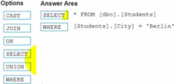
Explanation:
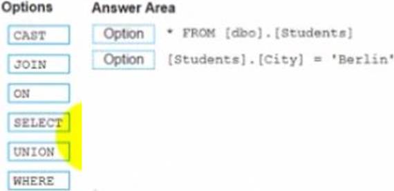
Select
Where
The correct way to complete the query is:
SELECT * FROM [dbo] . [Students]
WHERE [Students].[City] = ‘Berlin’
The SELECT statement is used to retrieve data from a table or a view. The * symbol means that all columns will be returned. The FROM clause specifies the table or view name and the schema name. The WHERE clause is used to filter the data based on a condition. The condition is [Students].[City] = ‘Berlin’, which means that only rows where the City column of the Students table is equal to ‘Berlin’ will be returned.
The other options are not relevant for this query. CAST is a function that converts a value from one data type to another. JOIN is a clause that combines data from two or more tables based on a common field. ON is a keyword that specifies the join condition. UNION is a set operation that combines the results of two or more queries into one result set.
Reference:
https://docs.microsoft.com/en-us/sql/t-sql/queries/select-transact-sql?view=sql-server-ver15
https://docs.microsoft.com/en-us/sql/t-sql/queries/where-transact-sql?view=sql-server-ver15
https://docs.microsoft.com/en-us/sql/t-sql/functions/cast-and-convert-transact-sql?view=sql-server-ver15
https://docs.microsoft.com/en-us/sql/t-sql/queries/from-transact-sql?view=sql-server-ver15#join
https://docs.microsoft.com/en-us/sql/t-sql/language-elements/set-operators-union-transact-sql?view=sql-server-ver15
정답:
Explanation:
A reference band is a shaded area that shows a range of values on an axis. You can use a reference band to highlight a target range, a confidence interval, or a standard deviation. In this case, you want to add a reference band that shows the range of values from 0 to 100 on the y-axis. This will create a shaded area behind the bars that indicates the percentage of sales. To add a reference band, you need to do the following steps:
Click on the Analytics tab on the left side of the workbook to open the Analytics pane. You will see a list of analytical objects that you can drag and drop onto your worksheet.
Drag Reference Band from the Analytics pane to Y-Axis on the worksheet. This will add a reference band on the y-axis that shows the average and confidence interval for all values.
Click on the Edit button on the reference band to open the Edit Reference Band dialog box. You will see options to customize your reference band.
Change the Band From value to 0 and the Band To value to 100. This will change the reference band to show the range of values from 0 to 100 on the y-axis.
Click OK to apply the changes. You will see that the reference band now shows a shaded area behind the bars.
Reference:
https://help.tableau.com/current/pro/desktop/en-us/analytics.htm
https://help.tableau.com/current/pro/desktop/en-us/analytics_referenceband.htm
https://help.tableau.com/current/pro/desktop/en-us/analytics_referenceband_edit.htm