당신은 온라인 연습 문제를 통해 Microsoft PL-300 시험지식에 대해 자신이 어떻게 알고 있는지 파악한 후 시험 참가 신청 여부를 결정할 수 있다.
시험을 100% 합격하고 시험 준비 시간을 35% 절약하기를 바라며 PL-300 덤프 (최신 실제 시험 문제)를 사용 선택하여 현재 최신 131개의 시험 문제와 답을 포함하십시오.
/ 29
Question No : 1
Note: This question is part of a series of questions that present the same scenario. Each question in the series contains a unique solution that might meet the stated goals. Some question sets might have more than one correct solution, while others might not have a correct solution.
After you answer a question in this scenario, you will NOT be able to return to it. As a result, these questions will not appear in the review screen.
You have several reports and dashboards in a workspace.
You need to grant all organizational users read access to a dashboard and several reports.
Solution: You assign all the users the Viewer role to the workspace.
Does this meet the goal?
정답: Explanation:
"You have five reports and two dashboards in a workspace. You need to grant all organizational users read access to one dashboard and three reports"
Question No : 2
Note: This question is part of a series of questions that present the same scenario. Each question in the series contains a unique solution that might meet the stated goals. Some question sets might have more than one correct solution, while others might not have a correct solution.
After you answer a question in this scenario, you will NOT be able to return to it. As a result, these questions will not appear in the review screen.
You have several reports and dashboards in a workspace.
You need to grant all organizational users read access to a dashboard and several reports.
Solution: You create an Azure Active Directory group that contains all the users. You share each report and dashboard to the group.
Does this meet the goal?
정답: Explanation:
Statements and questions are tricky and confusing. When the access is granted for the group (all users) for ALL (each) dashboards and ALL (each) reports in the workspace, then the will have read access to the specific (A, one) Dashboard and several reports, because they are part of all dashboards and reports. There is no statement, that for the other dashboards (except the one) and the other reports (except the several) that access must be prevented. They are also accessible (maybe it is not desired but not stated here).
Question No : 3
DRAG DROP
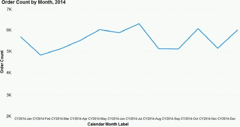
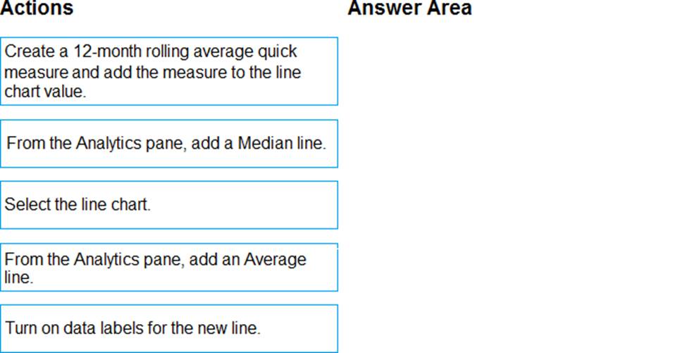
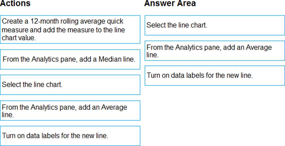
You have the line chart shown in the exhibit. (Click the Exhibit tab.)
You need to modify the chart to meet the following requirements:
✑ Identify months that have order counts above the mean.
✑ Display the mean monthly order count.
Which three actions should you perform in sequence? To answer, move the appropriate actions from the list of actions to the answer area and arrange them in the correct order.
정답:
Explanation:
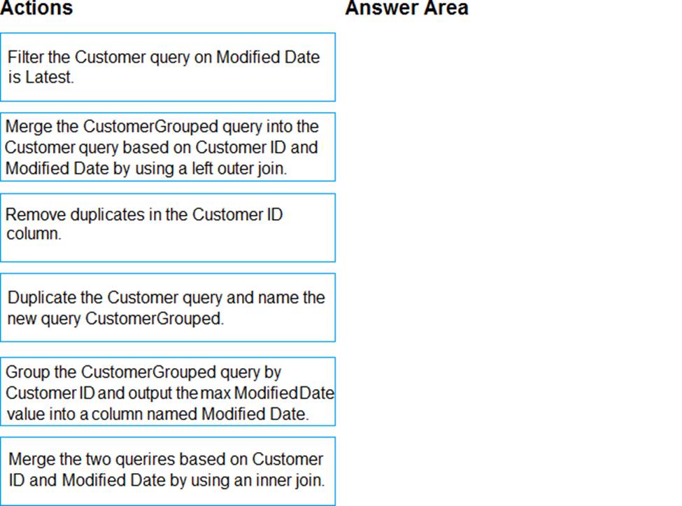
Question No : 4
DRAG DROP
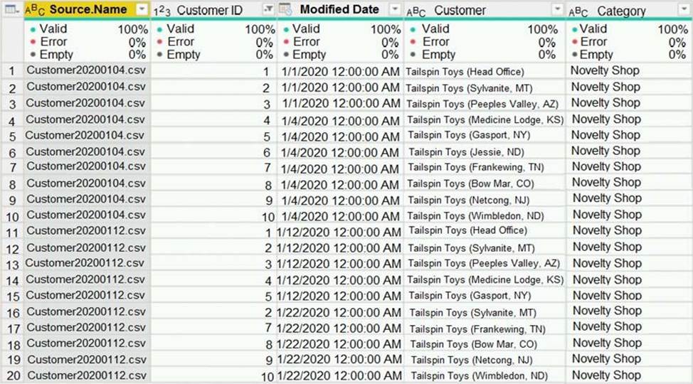
You have a query named Customer that imports CSV files from a data lake.
The query contains 500 rows as shown in the exhibit. (Click the Exhibit tab.)
Each file contains deltas of any new or modified rows from each load to the data lake. Multiple files can have the same customer ID.
You need to keep only the last modified row for each customer ID.
Which three actions should you perform in sequence? To answer, move the appropriate actions from the list of actions to the answer area and arrange them in the correct order.
정답:
Explanation:
1) Duplicate Customer query
2) Group by CustId by Max ModifiedDate (only 2 columns to keep)
3) Merge two queries on CustId and ModifiedDate inner join (to retreive other customer informations related to latest Date)
Question No : 5
Note: This question is part of a series of questions that present the same scenario. Each question in the series contains a unique solution that might meet the stated goals. Some question sets might have more than one correct solution, while others might not have a correct solution.
After you answer a question in this scenario, you will NOT be able to return to it. As a result, these questions will not appear in the review screen.
You have a clustered bar chart that contains a measure named Salary as the value and a field named Employee as the axis. Salary is present in the data as numerical amount representing US dollars.
You need to create a reference line to show which employees are above the median salary.
Solution: You create a percentile line by using the Salary measure and set the percentile to 50%.
Does this meet the goal?
정답: Explanation:
The 50th percentile is also known as the median or middle value where 50 percent of observations fall below.
Reference: https://dash-intel.com/powerbi/statistical_functions_percentile.php
Question No : 6
Note: This question is part of a series of questions that present the same scenario. Each question in the series contains a unique solution that might meet the stated goals. Some question sets might have more than one correct solution, while others might not have a correct solution.
After you answer a question in this scenario, you will NOT be able to return to it. As a result, these questions will not appear in the review screen.
You have a clustered bar chart that contains a measure named Salary as the value and a field named Employee as the axis. Salary is present in the data as numerical amount representing US dollars.
You need to create a reference line to show which employees are above the median salary.
Solution: You create an average line by using the Salary measure.
Does this meet the goal?
정답: Explanation:
Instead create a percentile line by using the Salary measure and set the percentile to 50%.
Note: The 50th percentile is also known as the median or middle value where 50 percent of observations fall below.
Reference: https://dash-intel.com/powerbi/statistical_functions_percentile.php
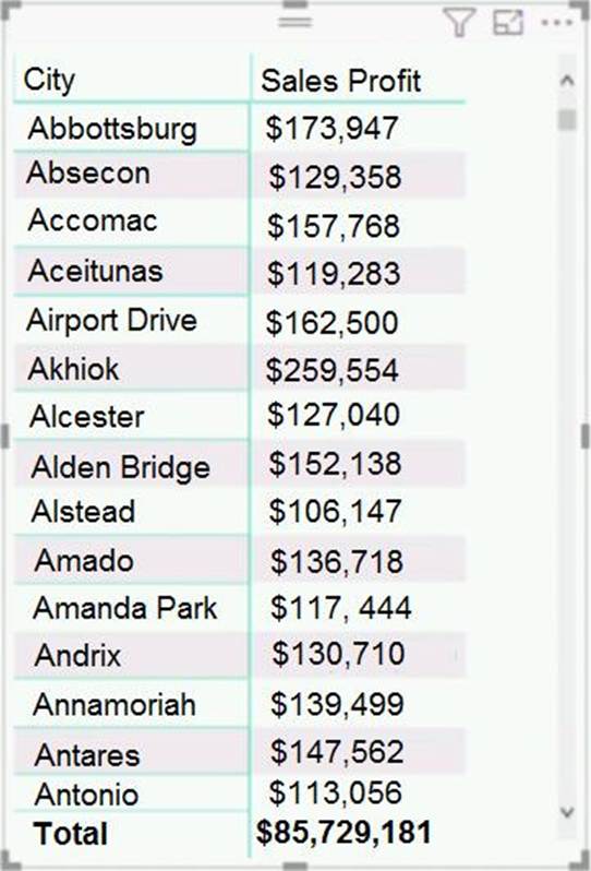
Question No : 7
You have the dataset shown in the following exhibit.
You need to ensure that the visual shows only the 10 cities that have the highest sales profit.
What should you do?
정답: Explanation:
Power BI Top N Filters are useful to display the top performing records, and Bottom N filters are helpful to display the least performing records. For example, we can display top or bottom 10 products by orders or sales.
Note:
Select the Column you want to display the Top Sales Profit
Then change the Filter Type of that Column to Top N
Fill in Top / Bottom number field
And lastly drag to the By Value filed your Sales Profit
Reference: https://www.tutorialgateway.org/power-bi-top-10-filters/
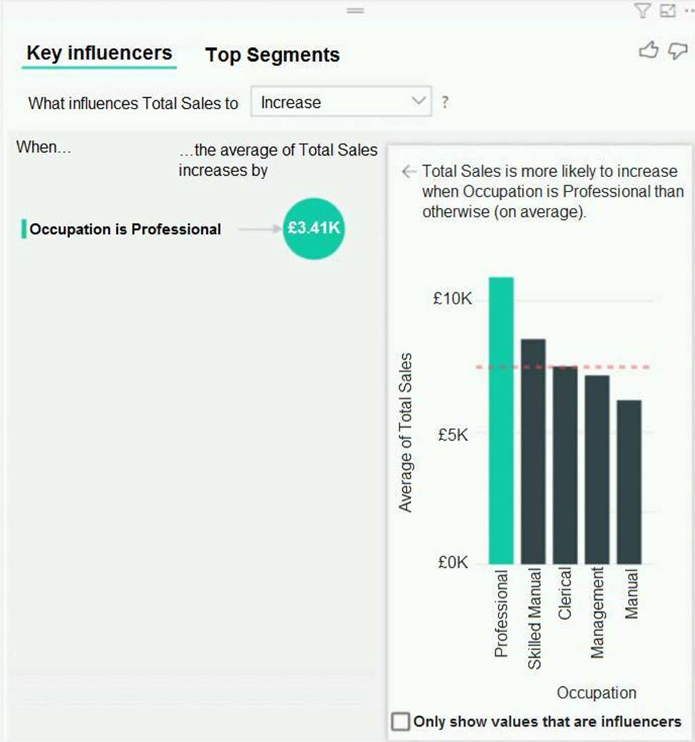
Question No : 8
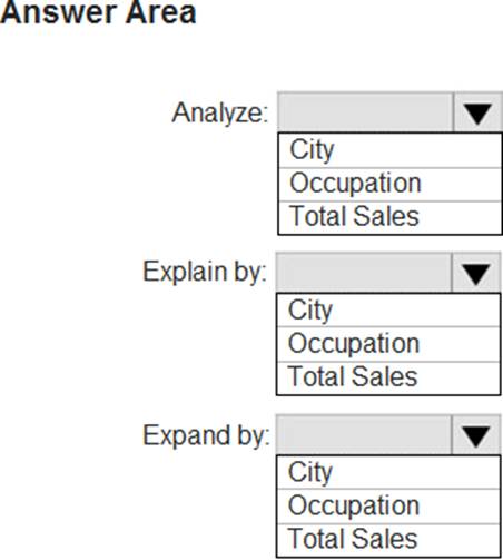
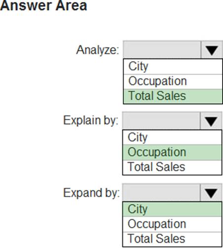
HOTSPOT
You have a table that contains the following three columns:
✑ City
✑ Total Sales
✑ Occupation
You need to create a key influencers visualization as shown in the exhibit. (Click the Exhibit tab.)
How should you configure the visualization? To answer, select the appropriate options in the answer area. NOTE: Each correct selection is worth one point.
정답:
Explanation:
Box 1: Total Sales
Box 2: Occupation
Box 3: City
You can use Expand By to add fields you want to use for setting the level of the analysis without looking for new influencers.
Reference: https://docs.microsoft.com/en-us/power-bi/visuals/power-bi-visualization-influencers
Question No : 9
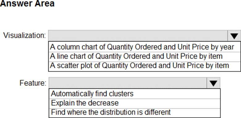
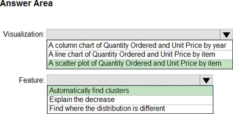
HOTSPOT
You have a dataset named Pens that contains the following columns:
✑ Item
✑ Unit Price
✑ Quantity Ordered
You need to create a visualization that shows the relationship between Unit Price and Quantity Ordered. The solution must highlight orders that have a similar unit price and ordered quantity.
Which type of visualization and which feature should you use? To answer, select the appropriate options in the answer area. NOTE: Each correct selection is worth one point.
정답:
Explanation:
Box 1: A scatter plot...
A scatter chart always has two value axes to show: one set of numerical data along a horizontal axis and another set of numerical values along a vertical axis. The chart displays points at the intersection of an x and y numerical value, combining these values into single data points. Power BI may distribute these data points evenly or unevenly across the horizontal axis. It depends on the data the chart represents.
Box 2: Automatically find clusters
Scatter charts are a great choice to show patterns in large sets of data, for example by showing linear or non-linear trends, clusters, and outliers.
Reference: https://docs.microsoft.com/en-us/power-bi/visuals/power-bi-visualization-scatter
Question No : 10
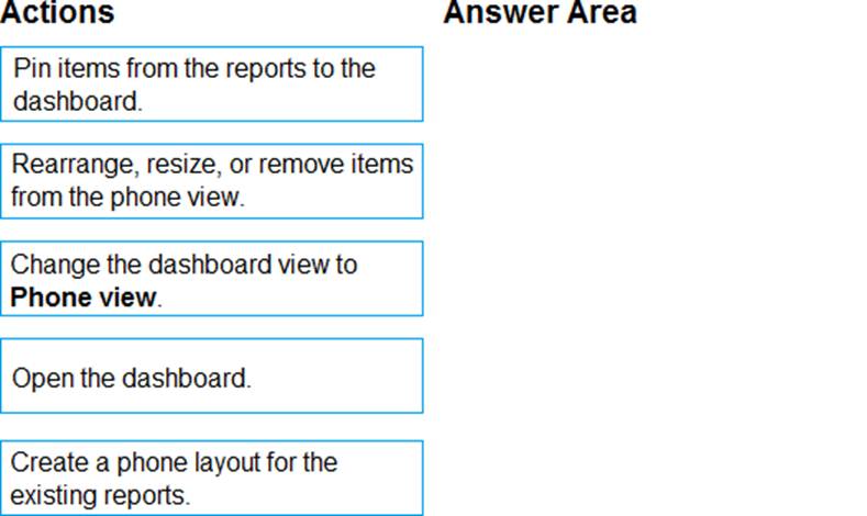
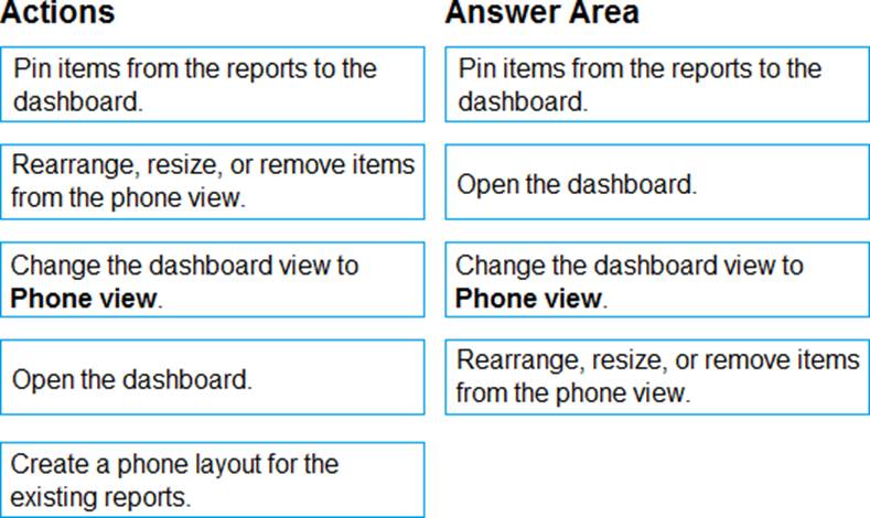
DRAG DROP
You are using existing reports to build a dashboard that will be viewed frequently in portrait mode on mobile phones.
You need to build the dashboard.
Which four actions should you perform in sequence? To answer, move the appropriate actions from the list of actions to the answer area and arrange them in the correct order.
정답:
Explanation:
Question No : 11
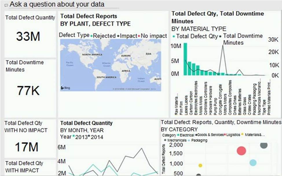
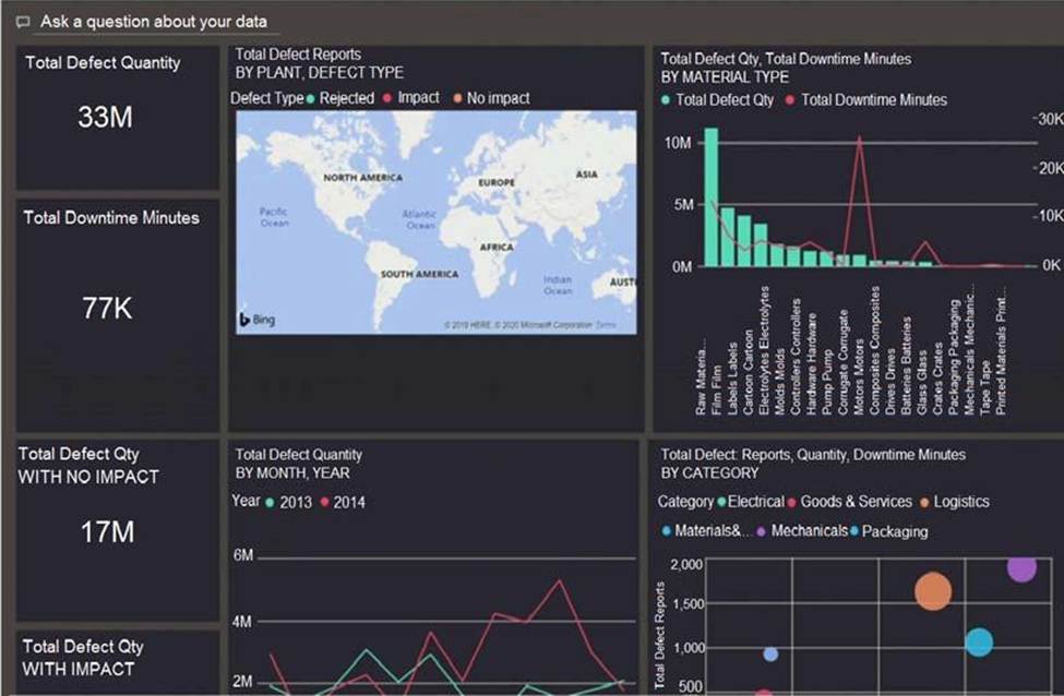
You have a dashboard that contains tiles pinned from a single report as shown in the Original Dashboard exhibit. (Click the Original Dashboard tab.)
You need to modify the dashboard to appear as shown in the Modified Dashboard exhibit. (Click the Modified Dashboard tab.)
You have a report that contains a bar chart and a column chart. The bar chart shows customer count by
customer segment. The column chart shows sales by month.
You need to ensure that when a segment is selected in the bar chart, you see which portion of the total sales for the month belongs to the customer segment.
How should the visual interactions be set on the column chart when the bar chart is selected?
정답: Explanation:
HIGHLIGHT as the question required us to "you see which portion of the total sales for the month belongs to the customer segment" -- in order to see WHICH portion, you need to still see the whole visual, highlight is most appropriate. If the requirement stated to ONLY SEE THE PORTION IT RELATES TO then filter would be appropriate.
Question No : 13
You have a line chart that shows the number of employees in a department over time.
You need to see the total salary costs of the employees when you hover over a data point.
What is possible way to achieve this goal?
You use an R visual to produce a map of 500,000 customers. You include the values of CustomerID, Latitude, and Longitude in the fields sent to the visual. Each customer ID is unique.
In powerbi.com, when users load the visual, they only see some of the customers.
What is the cause of the issue?
정답: Explanation:
R visuals in the Power BI service have a few limitations including:
Data size limitations C data used by the R visual for plotting is limited to 150,000 rows. If more than 150,000 rows are selected, only the top 150,000 rows are used and a message is displayed on the image. Additionally, the input data has a limit of 250 MB.
Reference: https://docs.microsoft.com/en-us/power-bi/visuals/service-r-visuals
Question No : 15
You are developing a sales report that will have multiple pages. Each page will answer a different business question.
You plan to have a menu page that will show all the business questions.
You need to ensure that users can click each business question and be directed to the page where the question is answered. The solution must ensure that the menu page will work when deployed to any workspace.
What should you include on the menu page?
정답: Explanation:
When you create a bookmark, the following elements are saved with the bookmark: - The current page - Filters - Slicers, including slicer type (for example, dropdown or list) and slicer state - Visual selection state (such as cross-highlight filters) - Sort order - Drill location - Visibility of an object (by using the Selection pane) - The focus or Spotlight modes of any visible object